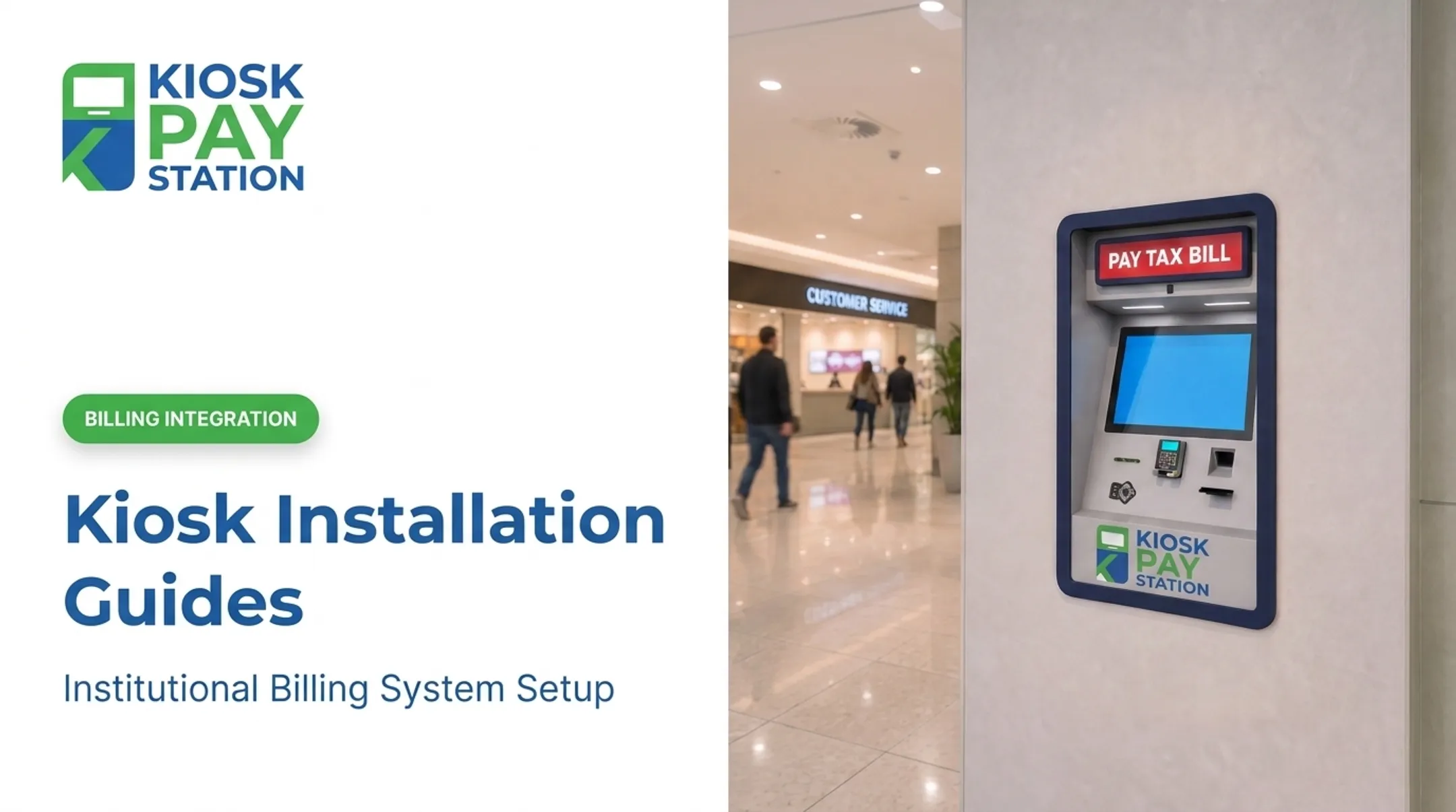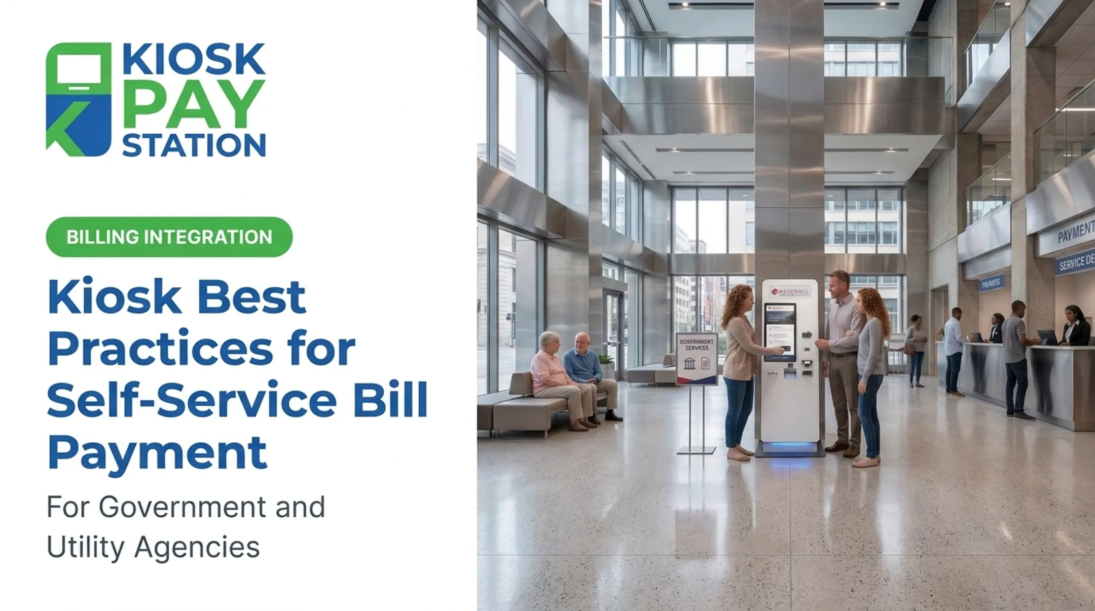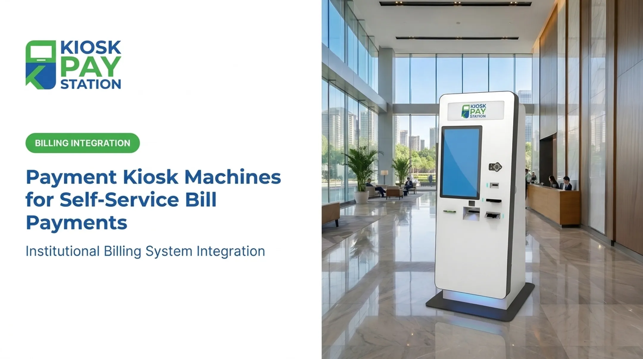

Riverside County's kiosks make this concrete. A simple header reading "Riverside County Property Tax Kiosk" with "PAY TAX HERE" turned two machines into collection points that outpaced eight staffed cashier windows, pulling in $3.01 million over seven days compared to $2.4 million collected at the counters. That's not a branding miracle — it's what happens when clear signage meets a reliable machine.
This article covers how to design kiosk signage that builds trust, meets accessibility expectations, and keeps the payment task front and center — not buried under decoration.
Key Takeaways
- Prioritize the payment task over decorative branding: logos and colors support the message, not replace it.
- Build signage hierarchy around what the kiosk does, who runs it, accepted payments, and the next step.
- Treat accessibility as a full requirement: contrast, plain language, multilingual support, and physical approach.
- Test signage on-site under real lighting and queue conditions, then maintain it as services change.
Why Payment Kiosk Signage Matters for Branding and Trust
Signage as a Public-Service Brand Touchpoint
For many residents, a kiosk in a city hall lobby or utility office is their most direct interaction with that agency. A well-branded, clearly labeled station signals legitimacy in a way that generic hardware never does.
Before anyone approaches, signage should answer:
- What is this kiosk for?
- Who operates it — the city, county, or utility?
- Can I pay my bill, citation, or tax here?
- Which payment methods are accepted?
- Where do I get help if something goes wrong?
A municipal service hall might have signs for "Department of Finance," "Municipal Utilities," "Vital Records," and "Payments" all within sightline of each other. Without a distinct, prominent kiosk header, customers waste time guessing which line or station applies to them.
Consistency Across Physical and Digital Touchpoints
The kiosk header, enclosure graphics, nearby wayfinding, touchscreen, confirmation screen, and printed receipt should all read as one system. Mismatched colors, logos, or terminology make people second-guess whether they've found the right station, especially in shared buildings with multiple departments.
Exterior graphics, informational signage, and the on-screen display should all match the operating agency's identity. When they do, a resident sees the same name and visual cues from the sidewalk sign to the payment confirmation—the standard Kiosk Pay Station applies when customizing signage and screen displays for the agencies it supports.
Function Before Decoration
Not every sign serves the same purpose. Separate them clearly:
- Branding signage — identifies the operating agency
- Instructional signage — walks users through the payment steps
- Directional signage — gets people from the entrance to the kiosk
- Required notices — legal or compliance disclosures
Picture a utility payment kiosk in a municipal building. A directional sign near the entrance says "Utility Payments →." A header on the kiosk itself reads "Pay Your Water Bill." The screen then walks through account lookup, amount due, and payment method — each step reinforcing, not repeating, the last.

Payment Kiosk Signage Design Principles
Build a Visual Hierarchy for Fast Scanning
Order information by priority:
- Organization or service name
- Purpose of the kiosk
- Primary action ("Pay Here")
- Accepted payment types
- Assistance information
- Fees or limitations, if any
Short headlines, generous white space, and high contrast let someone understand the kiosk before they're standing in front of it.

For physical signage, the Access Board's ADA guide on signs specifies non-glare finishes and strong light-on-dark or dark-on-light contrast. Character height must scale with viewing distance. Confirm current dimensions with an accessibility professional before finalizing sign specs.
Translate Identity Without Reducing Usability
Apply approved logos, colors, and typography, but skip busy backgrounds, low-contrast brand colors, or decorative fonts that slow reading. When multiple departments share a kiosk, make clear which agency owns the payment experience. That name goes largest and highest in the hierarchy; partner logos can appear smaller and secondary.
Write Concise, Task-Focused Copy
Skip jargon. State the task directly:
"Pay Your Property Tax" beats "Municipal Revenue Collection Services."
Include only what helps someone act:
- Accepted payment methods (cash, check, card, e-wallet)
- Account lookup options (QR code, barcode, account number)
- Receipt availability
- Service hours
- How to request help
Long paragraphs and unexplained abbreviations slow a payment task that should take minutes.
Coordinate Physical Signs with Digital Screens
The enclosure graphics, header panel, and nearby wayfinding should use the same terms as the touchscreen's welcome, payment-selection, confirmation, and error messages. If the sign says "Pay Your Water Bill," the screen shouldn't switch to "Utility Account Services."
Practical considerations matter too:
- Keep graphics clear of card readers, bill acceptors, receipt slots, and cameras
- Check for glare and viewing angle at typical approach height
- Use tamper-resistant, cleanable materials
- Confirm weather resistance for any outdoor placement
Design for the Installation Environment
Sightlines, queue layout, entrance location, and ambient lighting all affect placement and message length. A kiosk tucked behind a pillar needs a directional sign well before the unit itself; a kiosk in an open lobby may only need clear signage on the enclosure.
Before production, review applicable building, sign, and facility requirements, and confirm the installation won't obstruct required clearances or circulation paths.
Accessibility and User Experience
Plan for Accessible Use, Not Just Accessible-Looking Signs
Accessible signage means nothing if the kiosk itself is hard to reach or operate. This requires an approachable location, usable controls, and readable content working together.
Section 707 of the ADA Standards applies specifically to ATMs and fare machines, covering clear floor space, tactile controls, and speech capability. General payment kiosks may fall outside that section's direct scope, and the Access Board's guidance on electronic kiosks remains proposed rather than final. Don't assume general compliance — verify current requirements with a qualified accessibility consultant for your specific deployment.
Design considerations should cover:
- Visual — strong contrast, legible type, no color-only status indicators
- Auditory — voice guidance for key prompts
- Cognitive — plain language, short instructions, adequate time to read
- Mobility — reachable controls, clear floor space
Specify voice and light guidance alongside the touchscreen so visual, auditory, cognitive, and mobility needs are covered in the same flow.
Use Inclusive Language, Icons, and Multilingual Communication
Plain language and familiar icons paired with text help everyone, not just users with disabilities. Never rely on color alone to signal status — pair a red "error" indicator with text and an icon.
For language access, DOJ's LEP guidance recommends a four-factor analysis — the number of LEP individuals served, frequency of contact, importance of the program, and available resources — rather than a fixed language list. Translate vital instructions professionally; machine translation on payment or legal terms risks costly errors.
Offer a multilingual interface so residents can complete account lookup and payment in their preferred language, aligned with that four-factor analysis.
Map the Complete Customer Journey
The journey doesn't start at the kiosk. It starts at the parking lot or building entrance:
- Entrance or parking directions
- Identification of the correct payment area
- Queue guidance
- Accepted payment types (posted before the wait, not after)
- Account lookup, payment selection, confirmation
- Receipt collection and exit

Keep wording consistent between nearby signs and the touchscreen at every step.
Reduce Uncertainty Around Security and Privacy
Signage can reassure customers about who processes payments, how to get help, and what to do if a transaction fails. Be careful with compliance claims.
PCI DSS protects payment account data, and a QSA validates specific entities against a specific scope — it isn't a blanket badge to slap on a kiosk enclosure. EMV approval applies to the tested terminal and application, not automatically the whole payment environment. Have security, legal, and compliance teams approve any statement referencing encryption, PCI-DSS, or EMV before it goes on a sign.
Test With Real Users and Real Conditions
Prototype testing should include users with different mobility, vision, hearing, and language needs. Observe:
- Can they find the kiosk from the entrance?
- Can they read the sign from a normal queue distance?
- Do they understand the first screen without help?
Test under actual lighting, at expected viewing distances, and during busy periods with background noise. Use findings to revise copy, contrast, iconography, and screen prompts before full rollout.
How to Implement, Test, and Maintain Branded Kiosk Signage
Audit Brand, Service, and Site Requirements First
Build a content inventory: brand standards, department names, payment types, account lookup methods, support contacts, receipt policy, language needs, and legally required notices. Then survey the site — entrances, queues, lighting, floor conditions, and whether the unit will be standalone, countertop, or in-wall.
Prototype the Entire Experience Before Production
Mock up the header, enclosure, nearby directional signs, and every screen state — welcome, payment instructions, confirmation, errors. Get sign-off from communications, operations, accessibility, information security, legal, and facilities staff together, not in isolation.
Align Signage With Kiosk Configuration and Payment Capabilities
Signage should describe what the kiosk actually does — not generic claims. If it only accepts card and check, don't advertise cash. When software, screen displays, logos, and multilingual interfaces are customizable, agencies can match branding to real payment capabilities. Kiosk Pay Station supports that alignment through billing-system integration, monitoring, and configuration support for institutional clients—so on-screen and physical signage stay consistent with what the kiosk can actually process.

Important: any provider claims about ADA accessibility, PCI-DSS compliance, or EMV certification should be independently confirmed for your specific deployment — not assumed from marketing material alone.
Plan Rollout, Ownership, and Maintenance
Assign clear responsibility for:
- Approving content changes
- Updating service information
- Inspecting and cleaning signage
- Replacing damaged graphics
- Removing outdated payment options or instructions
Ask vendors directly about installation support, ongoing monitoring, and how content updates get pushed when branding or procedures change. For institutional clients, Kiosk Pay Station’s support model includes five-year onsite maintenance and component replacement, plus monitoring that helps teams push content updates when branding or payment procedures change.
Measure Whether Signage Improves the Experience
Track discoverability, task completion, payment errors, abandonment, and assistance requests before and after launch. Don't credit signage alone for outcomes unless your evaluation design actually isolates that variable — reliability and staffing changes often matter just as much.
Schedule periodic reviews to catch confusing wording, damaged materials, or mismatches between signage and the live payment workflow.
Frequently Asked Questions
What is signage in branding?
Signage is a visible brand communication tool that expresses an organization's identity in physical space. For payment kiosks, it combines identity, information, direction, and reassurance in one glance.
What is the difference between branding and signage?
Branding is the broader identity and how customers perceive an organization. Signage is one specific physical or digital expression of that identity. At a kiosk, it's the touchpoint where identity meets the payment task.
What are the 5 C's of branding?
One widely cited framework (Forbes, 2021) lists Corporate, Clarity of purpose, Consistency, Cost-effectiveness, and Customer connection. Versions vary by source, but consistency and clarity apply directly to kiosk signage.
What is the 3-7-27 rule of branding?
It suggests three interactions to notice a brand, seven to start remembering it, and 27 to build trust. It's a mental model, not a proven law, but it reinforces why repeated, consistent kiosk messaging matters.
How can signage improve the user experience at a payment kiosk?
Clear signage improves discoverability, sets expectations for payment steps, supports wayfinding, and reduces uncertainty. Consistent wording between physical signs and the screen builds trust before the transaction even starts.
What should payment kiosk signage include for accessibility?
Strong contrast, plain language, icons paired with text, multilingual options where needed, and accessible physical placement. Always verify specific requirements against current US accessibility guidance for your deployment.