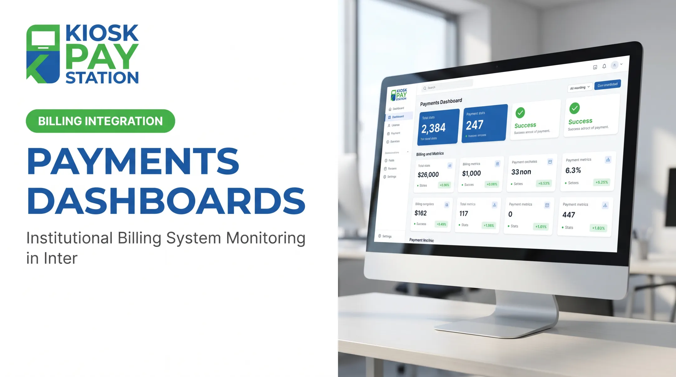

A payment analytics dashboard fixes this by pulling volume, tender types, success and failure rates, reconciliation status, service availability, and exceptions into one operational view. This article covers dashboard design, the metrics that matter for public-sector payments, data sources, security and accessibility rules, tool selection, and how self-service infrastructure feeds better reporting.
Key Takeaways
- Connect payment, billing, settlement, channel, and account data instead of relying on processor transactions alone
- Build metrics that tell staff what to do next, not just what happened
- Design for cash, checks, department codes, audit trails, accessibility, and multilingual service
- Keep dashboard data accurate, role-specific, and tied to clear alert ownership
What Is a Payment Analytics Dashboard?
A payment analytics dashboard centralizes payment transaction data across channels, tender types, departments, and settlement stages, then visualizes it so teams can act on it. Transaction lists, financial reports, and native processor dashboards each show only part of the picture. An analytics dashboard joins those sources into one operational view.
Useful dashboards operate on four levels:
- Descriptive: what happened (volume, tender mix, completion rates)
- Diagnostic: why it happened (decline patterns by processor, channel outages)
- Predictive: what's likely to happen (seasonal billing-cycle spikes)
- Prescriptive: what to do about it (staffing adjustments, exception escalation)
The Payment Lifecycle Matters
Authorization, settlement, and reconciliation are three separate events, not synonyms. A payment can authorize successfully and still fail to post to the correct account. Your dashboard should track each stage:
Initiation → authorization → completion → settlement → reconciliation → refund/reversal → archival reporting

Why Public Agencies Need a Different View
Ecommerce dashboards assume subscription billing and single-channel checkout. Government and utility payments don't work that way. Agencies deal with:
- Account-based billing tied to tax parcels, permits, or utility accounts
- Multiple departments sharing infrastructure (tax collector, courts, parking, utilities)
- In-person cash and check handling alongside digital payments
- Public accountability requirements that private businesses don't face
Essential Metrics for Government and Utility Payment Systems
Collection Volume and Channel Performance
Track transaction count and value by channel: staffed counter, online portal, mobile, kiosk, IVR, or lockbox. Compare trends against your agency's own baseline. Public-sector payment mix varies too widely for a single universal benchmark.
Break down tender types separately:
- Tender types: cash, check, credit card, debit card, and e-wallet
- Channel usage and settlement timing for each tender type
Add filters for department, utility service, location, account type, billing cycle, and date range so managers can spot localized issues instead of chasing noise in agency-wide averages.
Acceptance, Failure, and Completion Metrics
Don't collapse everything into one "success rate." Separate:
- Success and authorization: completed and approved payments
- Decline and timeout: failed attempts, broken into recoverable errors versus permanent declines
- Abandonment: where users leave a self-service workflow before finishing
Analyze decline reasons by payment method, processor, channel, and time period. A spike in declines from one kiosk during a specific hour points to a device issue, not customer error.
Reconciliation and Settlement Metrics
An initiated payment isn't a settled payment, and a settled payment isn't the same as one posted to the correct department. GFOA's guidance on payment consolidation recommends evaluating providers on daily deposits, exception listings, and electronic remittance. The same criteria apply to dashboard design.
Track these exception categories with a named owner for each:
- Unmatched transactions and duplicate records
- Missing settlement entries and timing differences
- Refunds, reversals, chargebacks, and manual adjustments
Build daily views for finance teams to compare processor reports against bank deposits and internal ledgers, plus a period-end rollup for close.

Public Service and Operational Metrics
Payment activity by hour, day, and billing cycle helps agencies plan staffing and maintenance windows. Track kiosk availability, interrupted sessions, receipt delivery, and language selection where the system can lawfully capture it.
Pair these operational numbers with customer feedback. A 98% completion rate can still hide confusing instructions or an inaccessible workflow that only shows up in complaints.
Risk, Security, and Audit Metrics
Refunds, chargebacks, and unusual payment velocity are indicators for review, not proof of fraud. Every dashboard needs traceable records showing who accessed, changed, or exported payment data.
Compliance note: PCI DSS v4.0.1 became the active standard after v4.0 retired at the end of 2024, with new requirements effective March 31, 2025. Confirm your specific validation path with your acquirer. Don't rely on general certification claims as a substitute for your own compliance review.
How to Create a Payment Analytics Dashboard
A payment analytics dashboard only works when it mirrors how your agency collects, settles, and audits payments. Work through these steps before you pick charts or a BI tool.
Define the Decisions and Users First
Identify who needs reporting and what decisions they'll make:
- Leadership: high-level trends, exceptions, service availability
- Treasury/finance: settlement and reconciliation detail
- Cashier supervisors: channel performance, staffing needs
- IT and audit: access logs, system health, compliance evidence
Separate executive summary views from operational detail so users see only what's relevant to their role, and nothing more than they need.
Inventory Sources and Build a Data Model
List every source: billing systems, processors, bank settlement files, cashier applications, kiosks, portals, and ERP systems. Define common fields across all of them:
- Transaction ID, account number, invoice number
- Department code, payment channel, tender type
- Amount, timestamp, status, settlement reference
This is where custom data elements matter. KIOSK PAY STATION, for example, attaches unlimited custom fields per transaction (department codes, account numbers, property IDs) so a kiosk payment can map directly to the right utility account or tax record without manual reconciliation.

Normalize and Validate the Data
Document one definition per KPI. Does "completed" mean authorized or settled? Standardize:
- Payment statuses and processor response codes across systems
- Timestamps, currency formatting, and department naming
- Tender categories (is "e-check" a check or an ACH transaction?)
Test the dashboard against source-system totals and known reconciliation exceptions before anyone relies on it for audit purposes.
Design Role-Specific Views and Alerts
Build separate views:
- Executive: total activity, channel mix, exceptions, trends
- Finance: settlement and reconciliation detail
- Operations: failures, interruptions, device performance
Configure alerts for decline spikes, settlement mismatches, repeated device interruptions, or unexpected refund patterns. Name who receives each alert and what they're expected to do.
Deploy With Governance
Set refresh schedules by need: near-real-time for monitoring, daily for settlement, and period-end for close. Define access controls, retention rules, and export permissions before launch. GFOA recommends visible data freshness and named responsibility to keep dashboards from going stale.
Government and Utility Requirements for a Useful Dashboard
Accessible, Reliable Payment Access
Your dashboard should show whether customers can actually complete payments, not just that a channel exists on paper. Track ADA-accessible design, multilingual interfaces, and receipt options as live status signals. Availability is client-controlled, not a universal promise: surface interruptions and maintenance windows instead of hiding them.
Security, Privacy, and Public Accountability
Minimize sensitive payment data on screen. Use tokenized or masked values, restrict access by role, and keep audit-ready logs. Procurement questions to ask any vendor:
- Where is data hosted, and who owns it?
- What's the incident response process?
- What are the retention and export terms?
- What happens during termination or migration?
Reconciliation Across Departments and Channels
A single dashboard should compare transactions from cashiers, kiosks, portals, processors, and banks while preserving department and account attribution. Document handoffs between payment operations, treasury, billing, and audit so every exception has:
- An accountable owner
- A defined resolution path
- Follow-up, not only a flagged total
Choosing Payment Analytics Dashboard Tools and Turning Insights Into Action
Compare the Main Approaches
| Approach | Strength | Limitation |
|---|---|---|
| Native processor dashboard | Real-time authorization data | Weak at joining billing, bank, and ERP data |
| Billing-system reports | Deep account detail | Limited cross-channel view |
| Spreadsheets | Flexible, low cost | Manual, error-prone, no real-time alerts |
| BI tools + data warehouse | Cross-system trend analysis | Requires ongoing engineering support |
| Purpose-built payment analytics | Multi-channel reconciliation | Vendor scope and integration effort vary |

Single-provider environments can often start with native reporting. Multi-channel public-sector environments (cashiers, kiosks, portals, and bank files all at once) usually need a normalization layer that combines everything into common fields.
Before committing, ask for a live demo using your agency's actual workflows: cash handling, account lookup by QR code or account number, departmental coding, and settlement file matching.
Turn Findings Into Action
Map what the dashboard shows to a specific response:
- Rising declines on one processor → investigate decline codes
- Kiosk sessions dropping mid-transaction → review payment-method availability
- Settlement totals not matching bank deposits → resolve mismatches before period close
- Repeated device interruptions → schedule maintenance
Use trend and segment views to test changes against a documented baseline. A completion-rate bump after a UI change doesn't prove the change caused it. Track it for a full billing cycle before drawing conclusions.
Where KIOSK PAY STATION Fits
KIOSK PAY STATION supports government and utility payment programs through billing-system integration, monitoring, and support that feed transaction, tender, account, and department data into a broader analytics stack. Payments can carry custom data elements such as account numbers, property IDs, and department codes, so reconciliation does not depend on manual re-entry.
Capabilities worth evaluating for dashboard integration:
- Unlimited custom data elements per transaction for account, property, and department coding
- PCI-DSS compliant, EMV certified payment technology
- Real-time, file-based, or non-validated data sync options
- Automated reconciliation and reporting that reduce manual matching work
Riverside County case study: Over a documented seven-day period, two Riverside County kiosks collected $3.01 million, outperforming eight staffed cashier stations that processed $2.4 million in the same window. This is a single case from one agency over one week. Treat it as a directional example, not a universal performance guarantee.

Frequently Asked Questions
How do I create a payment analytics dashboard?
Start by defining objectives and inventorying source systems, then standardize KPI definitions and normalize the data. Build role-based views, validate against source totals, set alert thresholds, and establish an ongoing review process.
What are the best payment analytics dashboard tools?
It depends on your channel mix: single-processor agencies often manage with native reporting, while multi-channel environments need BI tools or purpose-built payment analytics platforms. Evaluate based on integration effort, governance, and reporting depth.
What is a payment analytics dashboard?
It's a centralized interface that organizes payment activity, outcomes, settlement, reconciliation, and risk information so authorized teams can monitor performance and act on exceptions. It's more than a transaction list or processor report.
What are the four types of dashboards?
Descriptive dashboards show what happened (transaction volume), diagnostic dashboards show why (decline patterns), predictive dashboards forecast likely outcomes (seasonal billing spikes), and prescriptive dashboards recommend action (staffing adjustments).
What metrics should a government payment analytics dashboard track?
Track transaction volume, tender and channel mix, success and decline reasons, completion and abandonment rates, settlement exceptions, refunds, chargebacks, service availability, and audit activity.
How can utilities use a payment analytics dashboard to improve reconciliation?
Utilities can match processor, bank, billing, and channel records side by side to spot duplicates, missing postings, and timing differences. Assigning an owner to each exception category speeds resolution and keeps books cleaner at period close.